Thursday, June 28, 2012

Setting the Tone


This is in the basement of our house. I toned each canvas with a warm mix of yellow ochre and burnt sienna. The soft warm color gives a nice base for each subsequent layer of paint that is placed on top of it.

We then assembled all 4 canvases together. They just fit in my studio, which has an 11 foot high ceiling. In this photo my wife, Denise, gives the appearance that she completed the task by herself. Actually, it took 4 of us to manhandle  these into one single unit.


Monday, June 18, 2012

Canvas Maker

My dad has made and stretched many of my canvases in the 30+ years that I've been painting. Every once in a while a big project like this comes along and he needs to go into "super-sized" mode.


Here he is in the basement of the shop. This was back when the snow was still flying. He fired up the old pot-bellied stove you can see in the background, and went to work laminating poplar boards to create the sturdy stretcher frames for the canvases.


Here are a couple of photos of dad standing next to one of the larger lower canvases, showing the back side of the stretched canvas. The Prairie Winds artwork has four separate canvases–the top two canvases  in the piece are 48"x48" and the bottom two are each  48"x78". He also built into each canvas, a set of cleats which allowed for custom mounting these directly  and snug to the wall.

Dad has always been very creative and talented, especially when it comes to finding solutions to challenging projects that need to be built or fixed.

He was my first supporter and encourager to pursue my passion for art, encouraging me to draw and paint from my earliest memories of childhood.

Dad will be turning 77 on Thursday! If you'd like to post your greetings here, or send me an e-mail. I'll see that he gets them.

Friday, June 15, 2012

Prairie Winds proposal sketch


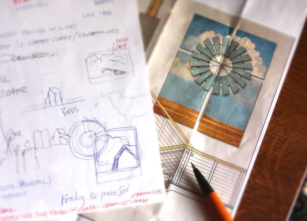
Here is the initial concept sketch I included in the presentation I gave when this artwork was in the proposal phase.

I wanted the art to be about the prairie, and the simple beauty of this part of the country. Some people think to you need a mountain or perhaps a waterfall to create a beautiful landscape.  Not true. Even over just the last few days here, I have marveled at the fantastic sunsets over lush fields filled with row upon row of young corn.

I am not sure exactly sure how the idea of including a real windmill came to me. The idea is pretty much out of the box for the art I typically create. That did excite me–and push me.

While the basic landscape has remained a constant here in Iowa, the windmill on the other hand represents change. The windmill serves as a metaphor for progress. Farm windmills like this have harnessed the prairie winds for generations. It also represents the hard-working, devoted and faithful people who have made this region their home.

Sunday, June 3, 2012

Prairie Winds commission

Proposal sketches for Prairie Winds Event Center
I'm hoping some of you may have missed seeing any kind of blog post these last few months. If you thought I gave up painting you'd be wrong. Actually I have been pretty  busy painting–I just haven't been blogging about it.

I'm having some regrets about that, because the process of my latest piece has been a pretty fascinating experience for me personally. Ultimately I decided not to blog about the process as I was doing it, because I wanted the finished piece to be a surprise. In hindsight I probably should have taken you along for the ride. Sorry. I'm hoping to document it on the blog in the coming weeks.

I am partially upset because as I look back now, my memories of timelines and dates have already faded somewhat. Hopefully you can forgive me for any details I may not get exactly right.

It all started late last fall when I was asked to be one of three artists to submit a proposal for a commissioned work of art to be placed on a large wall in the new Prairie Winds Event Center in Orange City, Iowa. We were given the architect's drawings of the space where the art was to be installed. We also saw renderings of the interior of the building which has a warm prairie lodge, almost craftsman feel to it. It is in contrast to the Dutch details of the exterior of the building.

Architect's rendering of the Prairie Winds Event Center
All three artists presented their proposals to an art selection committee. That committee then made their recommendation to the full Event Center board, and I was fortunate to be selected for the commission! I was honored to be asked.

I took quite a few photos as this progressed, so I'll be sharing those too. I hope you're all doing well. It is really starting to feel like summer.

Tuesday, February 14, 2012

Wednesday, December 21, 2011

Merry Christmas 2011

The 2011 Vander Stelt Gazette

It is hard to believe another year has passed us by again. We have a lot to be thankful for here at the Vander Stelt household and looking back on the year we have some really great memories. If you click on the photo above, the link is suppose to open a copy of our annual Christmas newsletter. I'm not sure if I got the code embedded correctly, so if it doesn't work I guess you're out of luck.

I need to admit that every year I complain and threaten that this is going to be the last year I write it because it is too much work. We send out more of these than I'd care to admit. I suppose it is my yearly contribution to help save the United States Postal Service.

This is the 23rd consecutive year for the Gazette. We always save at least a couple copies of each issue, and each year when I begin writing, I grab all the old issues to get inspired and to reminisce a bit. It always brings a smile to my face as I read stories of the vacations we have taken or of the things the kids have done over the years.

Typically we start working on the content a week or two after Thanksgiving, and try to publish by mid-December. It has always been a two page document, but it started in black and white 23 years ago and in 2000 it was upgraded to color. You can also see the improvements in computer technology, printing and probably my design skills because looking back at some of the early issues, they look pretty crude in style compared to issue 23. But even though it is 23 years later, it is still an awful lot of work. Maybe I'll give up doing it next year.

Merry Christmas from the Vander Stelts

Monday, December 5, 2011

The Angels' Song


It's hard to believe that Christmas is less than three weeks away. Our little town is rather known in the area as a place to come and view outdoor Christmas lighting and displays. I have shown some of my lawn displays in the past, and decided to paint a new one this year.

I also thought it might be fun to take a few snapshots of it as it progressed so you could see how it developed. Above you can see the first shot I took.


This is at the point where I started to block in the fiery bright angelic colors. It started to come to life a bit more at this point.


Here is a close-up at an early stage of a shepherd's face. This particular shepherd is probably my favorite. I didn't put a lot of time into any of the figures, mostly because people are almost always driving past and viewing it from the road. Viewing from that distance forgives a lot of errors.


This is a closeup of the lower part of the angel. This was probably the most fun to paint. Free flowing paint and brilliant colors.


We put it out in the front yard on Wednesday of last week. The paint was not fully dry, but we put it out anyway. It snowed 3-4 inches this weekend, so it looks really nice surrounded by a fresh layer of the white stuff.


The Angels' Song
Here is a little better look at the entire finished piece. It is what I would call a very traditional interpretation of this scene–one you might see in a Sunday school classroom. I think people are drawn to the traditional images and music that permeate the Christmas season.

If you are in the area, I invite you to come view the lights as well as the new painting at the Vander Stelts.


Wednesday, November 16, 2011

Santa Fe


Here are a few photos I shot on a trip that Denise and I took to Santa Fe, New Mexico this fall. It is a place I've always wanted to see and it lived up to my expectations. The color, architecture, culture, food and art were all wonderful.

The Taos Pueblo


El Sanctuario de Chimayo
I've been working on a large new painting for Christmas. I hope to have it done soon so we can put it out on our front yard for display this Christmas season. Stay tuned.

Monday, September 12, 2011

Dad's Profile


Dad's Profile | 6"x6" | oil on hardboard
My Dad is always a good subject for a portrait. He has had a big white beard for many years and turns the heads of a lot of small children at Christmas time.


I remember drawing his profile when I was a kid. I don't know if that drawing is still around or not. There is something I like about a profile. The window light streaming into the room really worked perfectly in adding dimension to his face. This was based on a photo I took after a Sunday dinner at my brother Bruces' house.